Design 1
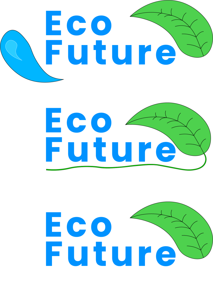
The first logo doesn’t work. Although it does include both the imagery and colours desired, there’s nothing conceptual about it. Having the graphics as 2 separate objects uses up more space than necessary, but their positioning also creates a more awkward shape to the overall design. The colours are what is envisioned for the branding, but the rest of this design wasn’t right.
Another attempt to make the logo a more conventional shape included adding a leaf stem to round off the logo and remove the water drop. The stem didn’t add anything useful to the design and instead made it look messier, especially with the weaving line. Having it straight wouldn’t change anything either, as in general having the line wasn’t visually appealing.
After removing the line, it looked much better but there was still nothing conceptual about the logo apart from the nature connotation of the colours. These designs were helpful though as seeing both the green and the blue together confirmed that they would work well. Out of both colours, blue is more commonly used in text than green, so the font continued to stay in the blue colour.
Design 2
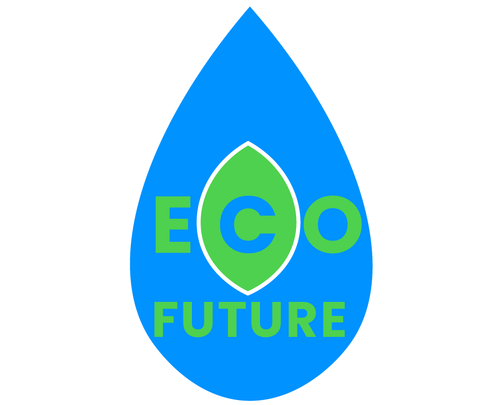
To give a more refined shape to the overall logo and also include the original idea of having both a water drop and a leaf, the idea to combine them both into one shape within another was tested. A basic undetailed drop and leaf were made with the leaf then put around the middle of the drop. For the location of the text, I adapted the tracking of the letters in ECO to fit them in both the drop and leaf. Although it does fit, with the E and the O being quite different in width, the E side ends up having lots of extra space, giving an uneven feel to the middle section of the logo.
This design is also not versatile, as its height could cause issues seeing as shrinking the shape will need to shrink the name too. For longer length banners, having the text larger will be easier if the name isn’t fixed within the shape.
Design 3
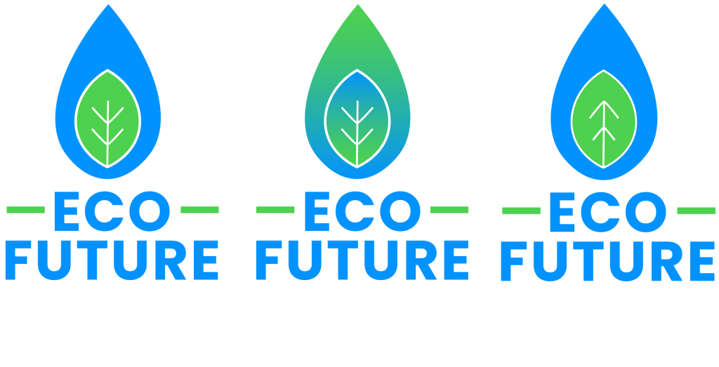
As mentioned for Design 2, the logo needed to be more versatile. The text has been moved out of the logo, making it much easier to read and giving more options for any layout adjustments that need to be made to fit into advertisements easier. Because the text was no longer in the shapes, more detail was added to the leaf graphic to add more interest to the logo in the form of some leaf veins. This created the opportunity to connote the future aspect of the company by rotating the veins to look like upward arrows.
For the colouring, a gradient was also tried by blending the blue and green, but this gave a less professional feel to the logo so was removed. The standard, singular colours work better as these will be easier to create contrast to any backgrounds seeing as only one colour is needed to contrast as much.