
Throughout all banners, a consistent use of main elements has been used, specifically the logo, slogan, and colour scheme. This creates an easy to recognise brand identity for the viewer to relate to any other advertising to do with the brand.
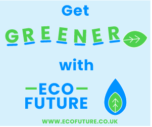
In landscape banners, an alternate logo design has been used which is also longer in length than height opposed to the original. Because the logo design ended up having the text separate from the graphic, these can both be individually resized and repositioned to better suit any canvases that the logo goes on. As intended, this logo design has been adaptable, allowing for the different sized banners to not be as restrictive as if another design had been used.
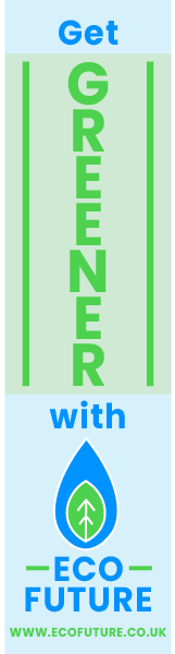
For the portrait banner, the original logo fits well as its height is no longer as much of a problem as it is in landscape. Both the size of the text and logo can stay the same to give the logo the intended look. On this specific design, an extra background colour of a light green has been used to help highlight the “greener” part of the banner. Both this green and the light blue are very similar to the background colours used across the website, once again continuing the brand’s identity.