Mid Fidelity
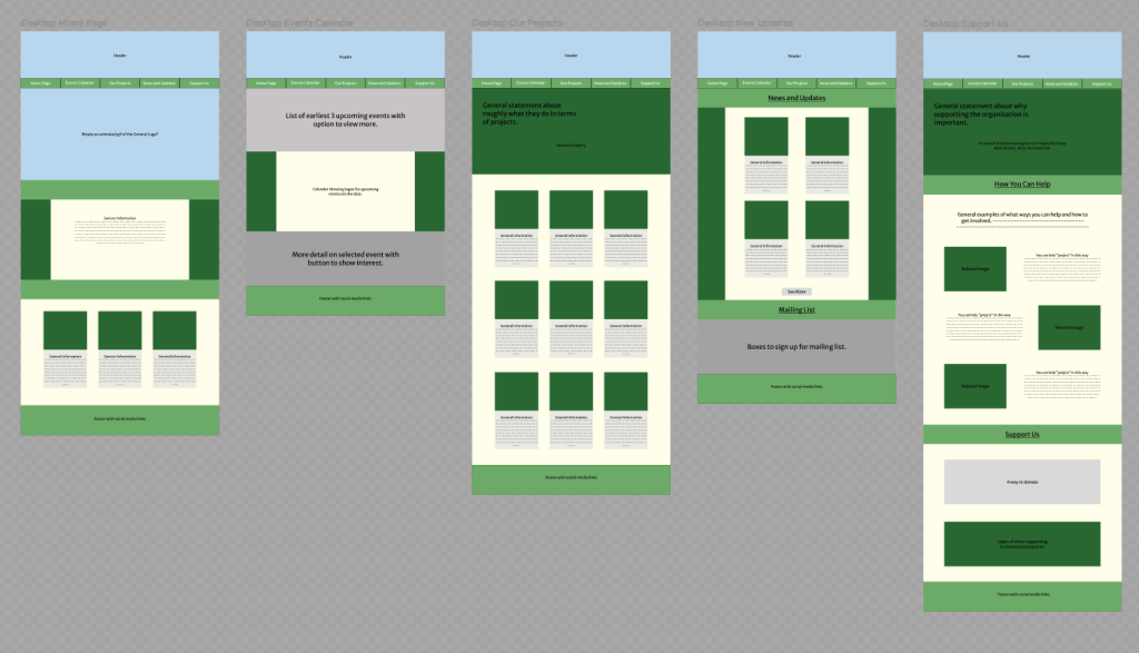
Basic functionality has been added such as the ability to change page, view a project, view an event on the calendar, and view a post from the “News and Updates” page. These also have buttons at the bottom of the page to allow the user to navigate back to the original page. It’s not necessary as there is the bar at the top of the page, but it’s another option for the user to use once they’ve scrolled to the bottom of the page. This means you can get an idea of how to navigate the website and what each extra page will roughly look like. The general colour palette has also been added, with the darker greens used as placeholders for any images that would be used.
There are quite a few grey areas especially in the “Event Calendar” page, but this is because these are sections where there would be a lot of buttons and changing text which I’m unsure of how to lay out yet. The mailing list area is also empty, but this would most likely be something that would be embedded in a final version.
App
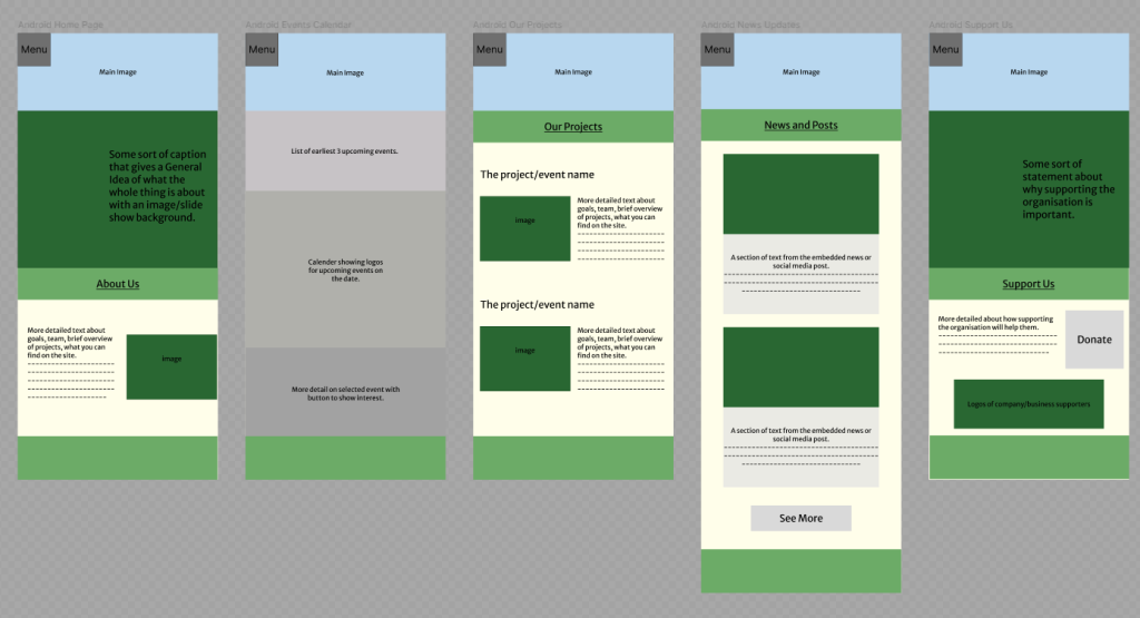
A drop-down menu is now accessible in the app version which is the main way to navigate the app. This was added to make the menu more accessible as you no longer have to reach towards the middle of the screen which could be harder to access. Each button now takes you to the relevant page with the box being clickable to open and close the drop down.
High Fidelity
All photographs used in the designs have been taken and given by Pollinate Eco Garden.
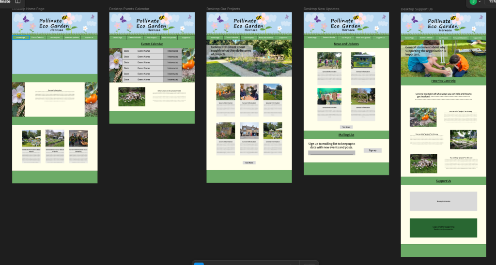
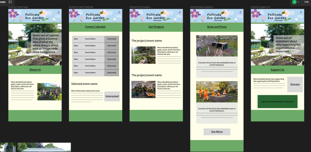
When entering any page, the header showing the name will be displayed. This is made by a variation of the circular logo, with the web version having the menu within the grass at the bottom of it. For the app, the drop-down menu button is visualised by a flower similar to the ones used in the logo. This keeps a consistency throughout the branding but also makes the menu icon more interesting than the classic burger icon.
The mailing list and calendars now have a basic idea of what they could possibly look like. They don’t need to be overcomplicated, so for the mailing list it would be a case of entering your email then clicking sign up. With the calendar, there would be a bit more functionality as there would be a list of upcoming events with dates and names but also a button to show interest in the event. This would allow the organisation to get a rough idea of how many people would want to attend just from an online side.
Only on the web home page, the animated logo has been added. This adds a visual element that instantly grabs the attention of the viewer, while being a sustainable feature because of its low file size. All images, excluding the gif, are less than 1 megabyte which also will help with loading times.
2 pages on both the web and app also have slide show images once on the page allowing more images to be shown but in a confined space. All images would be related to the page they are on and can be interchangeable depending on if the projects on the page change too. Viewer would be welcomed with a fresh view of the page when entering, keeping the site interesting and encouraging users to return again.