Group 1
Campaign Planning
This group originally came to us with the idea to “enhance client engagement and brand perception by increasing satisfaction scores of eDecks presentations by 30% through improved visual and content design”. Their potential target groups to focus on consisted of homeowners, gardeners, DIY hobbyists and small-scale landscapers with this needing to be narrowed down to 1 or 2 specific choices.
However, there was then quite a drastic change in target audience within the next plan which aimed specifically at business owners and property managers. The reason behind this is to create a campaign that encourages businesses to bring in more profit by utilising their outdoor decks in winter. This will allow both Kennings and any businesses that invest to increase their usually dropping profits during the winter months as eDecks will supply the businesses, and the businesses can attract more customers.
For the forms the campaign would take place in, a mix of static and video social media posts along with Google and Facebook Ads seemed the most ideal options to achieve what was desired. Content that needed to be included were a range of key selling points, sale promotions and incentives, calls to actions and also specific product focuses.
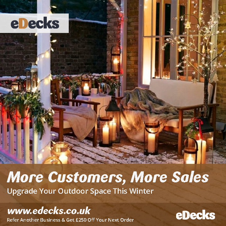
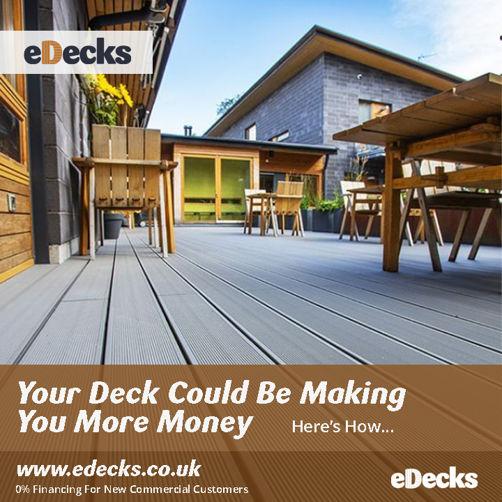
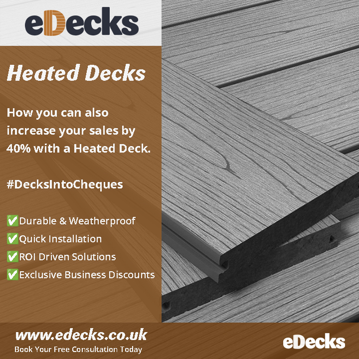
Created Posts
Each post created uses image taken from eDecks’ Instagram and Pinterest accounts. Overall, nothing was “rebranded” but instead tidied up to look in more of a professional manor than many of their current posts. The aim of this is for the brand to look more trustworthy and reliable whilst still keeping to their core themes across their sites. The same fonts have been used along with a similar colour scheme with the main “wood brown” from their original colour palette for continued brand identity. Using the idea of the “Z-Pattern”, the viewers eyes will begin and end on the eDecks logo, making it clear what brand this is.
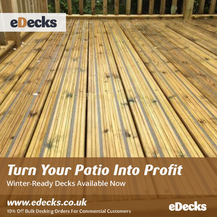
For the ads I’ve aimed for more of a focus on a main image with minimal, specific text to encourage continuing to the website which would probably be specific product pages, blog posts, or even just the homepage. These blocks of text have plenty of room to give an enticing description of the post for the viewer to encourage them to continue.
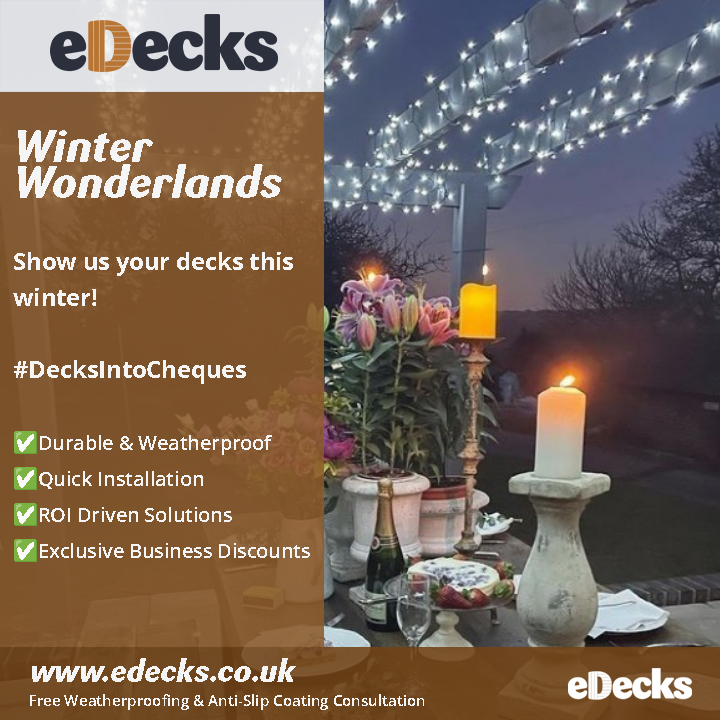
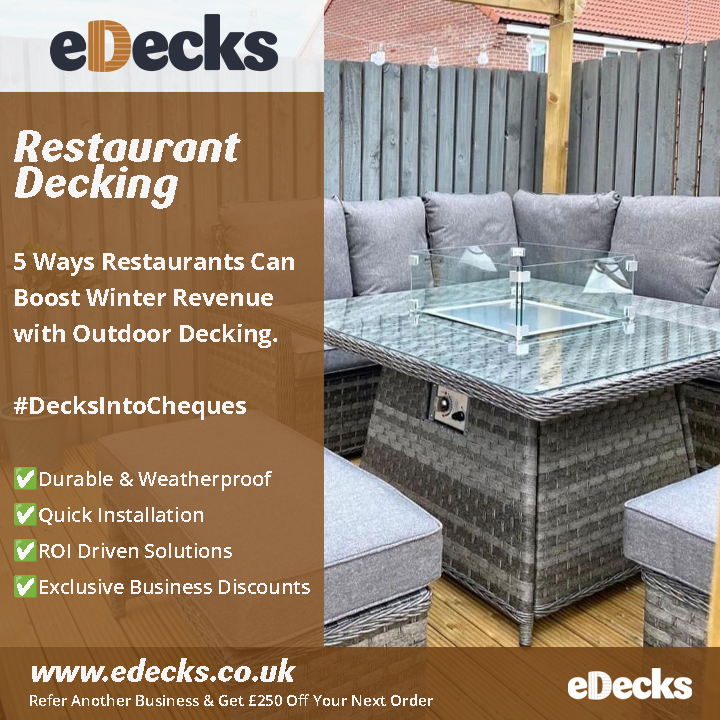
Posts have space for a lot more text so it can all be close to summarised in one place and more adaptable for case studies, success stories and engagement challenges. Once again, the same fonts and colours are used as the original branding but have been adapted to a more suitable and professional format. Having information set out this way creates a user-friendly experience for the viewer as the layout is easy to follow with little distraction.
Reels have a larger focus on what can be images or videos. Included in these examples are 2 possible variations of how text can transition onto screen. These also minimalize the text shown on screen and let the imagery catch the viewer’s attention instead. They would be best used to show off work that eDecks have done such as garden transformations or also showcasing larger product ranges.
Group 2
Unfortunately, after chasing up this group many times, they did not make an effort to send what they were wishing for us to help with. On our last available day, they mentioned doing a “Winter deck transformation” campaign however did not expand on what this would be. Collectively, we decided our efforts were best focused on Group 1 as this group was active and willing to help us to understand exactly what they needed.