To make it as easy to navigate as possible, an options bar is at the top of the page with 5 simple page names. This reduces the chance of confusion or getting lost in the site, as there are only 5 pages that are clearly labelled. One problem that might need to be addressed, is that the opening page is not accessible through that bar. I felt this was not needed as all it did was give the same 5 options as the options bar. The home page could actually be removed, with The Festival instead being the main page, as this would reduce the amount of steps needed for a user and provide 5 straight to the point pages instead.
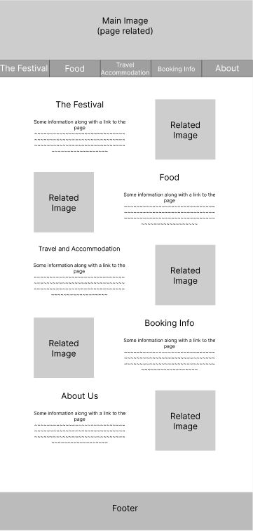
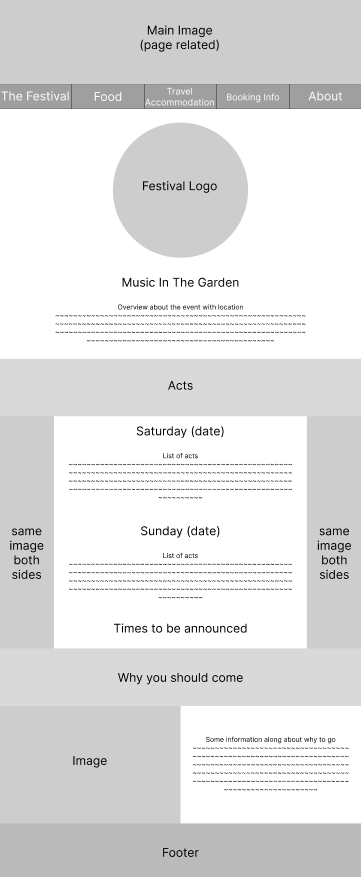
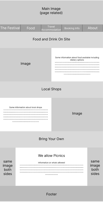
Similar to Victorious Festival’s site, each page uses quite a consistent page structure, allowing continuity to be clear throughout each page. Although they may seem quite basic, this allows for simplicity to be easily achieved, helping to increase the chance of users finding the site to be easy to use and navigate. To make sure everything is easy to find, there are only a few scrolling features instead of basic columns, such as the team section, as these would take up too much space otherwise. However, this gives some more interactive elements to add interest to the page.

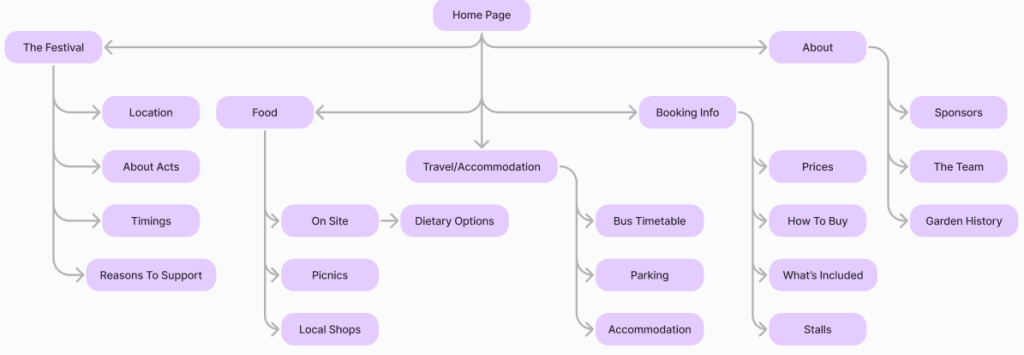
This Hierarchical Task Analysis shows where each page leads to and what is on it. This helps to clarify the amount of information on each page, showing that roughly the same number of points are covered in each to evenly spread out the information. This ensures that no page is much more or less crowded than another, meaning viewers are not over or underwhelmed by what is there.