Adapting the web design to conform into a better suited style for an app required mainly minor changes, with a few major changes to increase the ease of navigation along with decreasing the likeliness of having a stressful user experience.
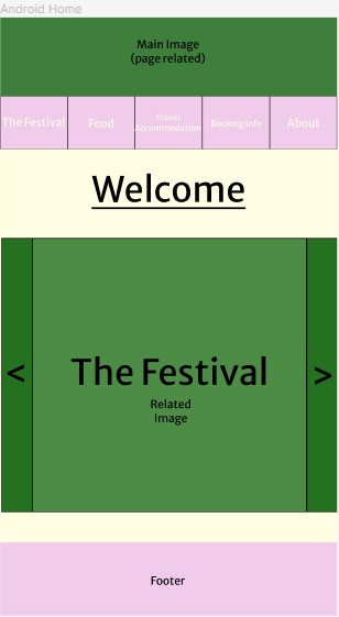
Firstly, the navigation bar at the top has been widened to make clicking each option much easier to do. Keeping smaller buttons would have increased the likelihood of a stressful experience, as it would be harder to press the separate buttons with your fingers than it is with a mouse. Larger buttons make them much more accessible, especially for anyone with larger fingers that may struggle to click the right ones if they are smaller.
The landing page has been changed to include a large image with the page name on top. This is a scrollable feature that has buttons on both the left and right to allow the user to view which pages are available. This adds an interactive element to the landing page, while also creating a simple to use layout in a more confined area. This is beneficial for a mobile app, as there is less information to try and read, and it is also more visually designed to help minimise the amount of text.
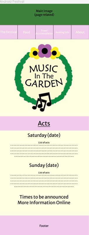
The festival’s main page is heavily visual, with textual information being largely cut out. With around 80% of users saying they download the app after viewing the online site, it felt unnecessary to include as much information as the online version does. The overall structure is rather similar, with it showing the logo and the acts, but general information such as the festival background and “Why you should come” section has been removed and replaced with “More Information Online”. This allows pages to be straight to the point with specific information. If a user was to be using this app on the go and around the festival, they would not need to know information on why they should go, but act times and dates would be extremely helpful so they can plan their day around those and easily know where they need to be.
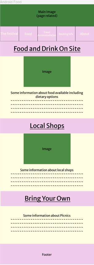
To allow for the font size to be increased, sections where there is information alongside an image have had to be changed. Moving the image to above the text has given more space on either side to enlarge the font. This largely increases the readability on small screens without sacrificing too much necessary detail. It does however, make the design look much simpler, which is positive as it supports having an easily navigable design, but could be seen as less interesting than the web version. Some images, specifically ones that are on both sides of text, have been cut out completely. Resizing these wouldn’t work as they were horizontal and narrow.