Wireframe
Wireframe – https://www.figma.com/file/HoRVVwWhNudG58lsVJh00P/LF-App?type=design&node-id=0-1&mode=design
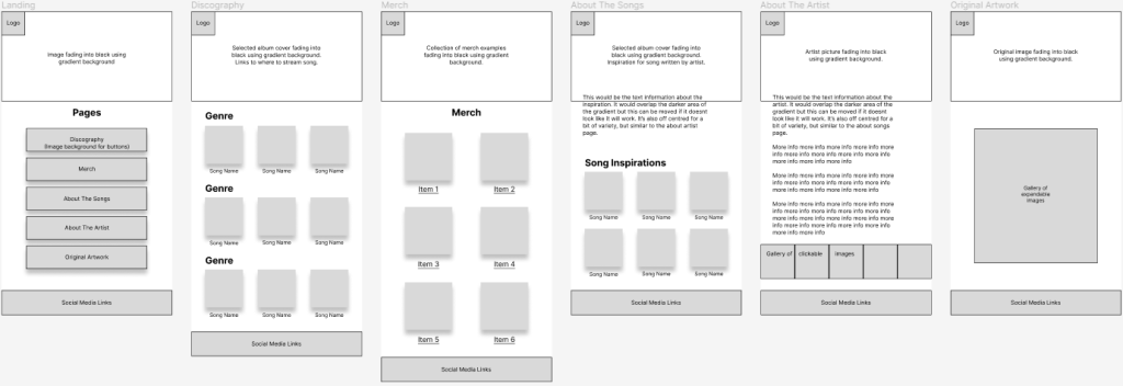
This rough idea shows how each element will be laid out in the high fidelity design. Space has been left to change features around if needed and some ideas like the gallery on “About The Artist” can be removed if they don’t feel like they fit in with the rest of the page.
In “Original Artwork”, only one large square has been used to represent where the images will go. My idea is that multiple images will fit into that area which can then be clicked and expanded to view the images in a larger view. Having them in a sort of collage layout gives an artist feel to the page and adds more interest than a basic collection of separate square images.
Pages with grids of songs/items can be expanded if needed, but they’ve been kept to a minimum to represent the general idea of the page contents.
User Flow
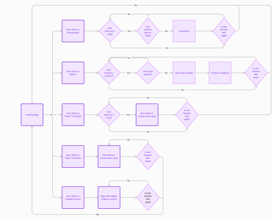
There are only 3 pages out of 6 where the user does not have to make a decision once on the page (apart from choosing to leave it) which are the “About The Artist” page and the “Original Artwork”. This is because these only show one piece of information, or a small amount that doesn’t need to be sectioned up. “Discography”, “Merch”, and “Song Inspiration” require up to 2 decisions as these allow the user to first choose a song or product, then proceed to listen, add to basket, or read about it.
If the merch page was to be expanded into more depth, an option to view and edit your basket could be implemented where the user can choose to add or remove more items from their basket along with checking out. This would be the same as if the “Stream” button on discography worked, as then they could have the choice of pausing, looping, or adding the song to their playlists.