High Fidelity – https://www.figma.com/file/HoRVVwWhNudG58lsVJh00P/LF-App?type=design&node-id=61-56&mode=design
After implementing the correct colours and images, the contrast between the content and background does make features easy to find because of the black background compared to the brighter colours in the album artwork and white text. The blending header also creates the desired effect and helps guide the viewer into the page using the fading colours into the background.
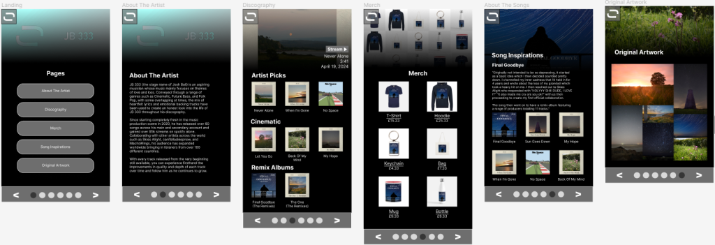
On “About The Artist” I did end up removing the gallery as it felt unnecessary being there. Although it means the only visual element on the page is the header, it makes the information more confined and simpler with the option to view images on other pages instead. This feature could be added back if used for a different artist, but for the one used there was no images that would fit into the section.
In the drop down menu at the top left, the option to switch between the web and tablet version has also been implemented (and to the phone and other version on web and tablet). This increases the accessibility if users prefer a certain layout or want to access the slight bit of extra information from the web version.
With the “Original Artwork” page, unfortunately the gallery idea did not end up working as the overlapping of each image wasn’t working correctly once finished, so instead this has been left as one set of images.
In the footer where it was originally planned for social media links, it’s been changed to another way to navigate between pages. 2 simple arrow buttons can be used to flick left and right between pages with a bar to show which page you are on. This will help users understand whereabouts they are in the site and also give them a more accessible option to change page once they’ve scrolled to the bottom of one. A possible feature that could’ve been added to this was the ability to also click the dots to go between pages, but with it being such a small screen this could have become frustrating for users if they kept clicking the wrong one.