Design 1
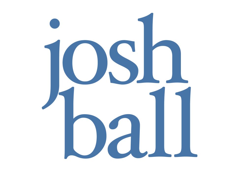
The reason I have chosen these 2 text types is because I think that they are both clean types. With the first serif example using Athelas, I feel that having all the characters as lowercase suited it best as the j and the b flowed nicer with each other than capitals. The descender line on the j lines up in a complimentary way with the ascender line of the b, whereas capitals would not give that same effect as the J would sit on the baseline. The serif font also connotes a sense of “class” which makes it feel more sophisticated if taking a more professional approach. I have also currently used a colour close to navy blue for the typography colour to stick within the sophisticated theme as it is quite a rich colour. According to Color Psychology (2023) “Navy blue is seen as a color that conveys authority, professionalism, and trustworthiness.“
Design 2
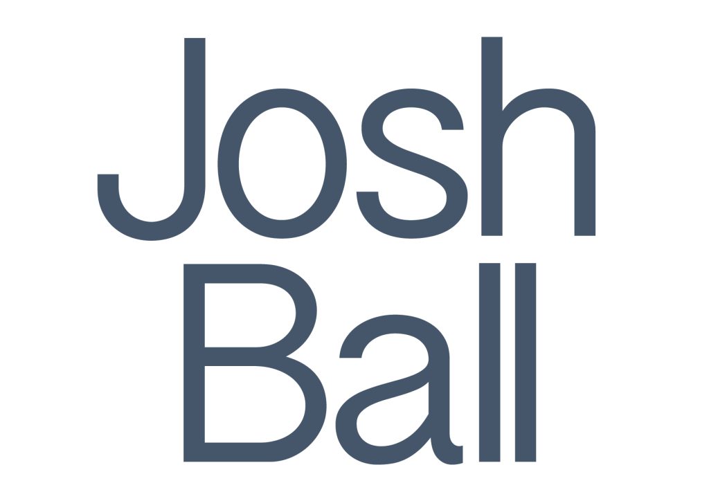
The second example uses a dark grey and sans-serif font named Grantha Sangam MN. This is to give a more casual look to the typography. Sans-serif also works better in this example as it allows the terminals of one half of the h and one l to line up. This helps to give the overall feel of the typography a more ordered/organized feel as both names line up with each other. One problem with it however is that I feel in general it does not look as professional as example one. Kimp (2023) states that “Serif fonts evoke “trust” and a sense of “tradition”. On the other hand, sans serif fonts are seen as more forward-looking.” This is another reason Serif works better for me as there needs to be a trust between the client and designer that their ideas can work together.
There is no alteration between both names as they are both centred which is not creating any leading for the viewer to follow. This also leaves a lot of blank space before the B and after the last l whereas on example one they fit together much better. This is mainly because of the serifs on the l’s as they make a bigger kerning needed between them.
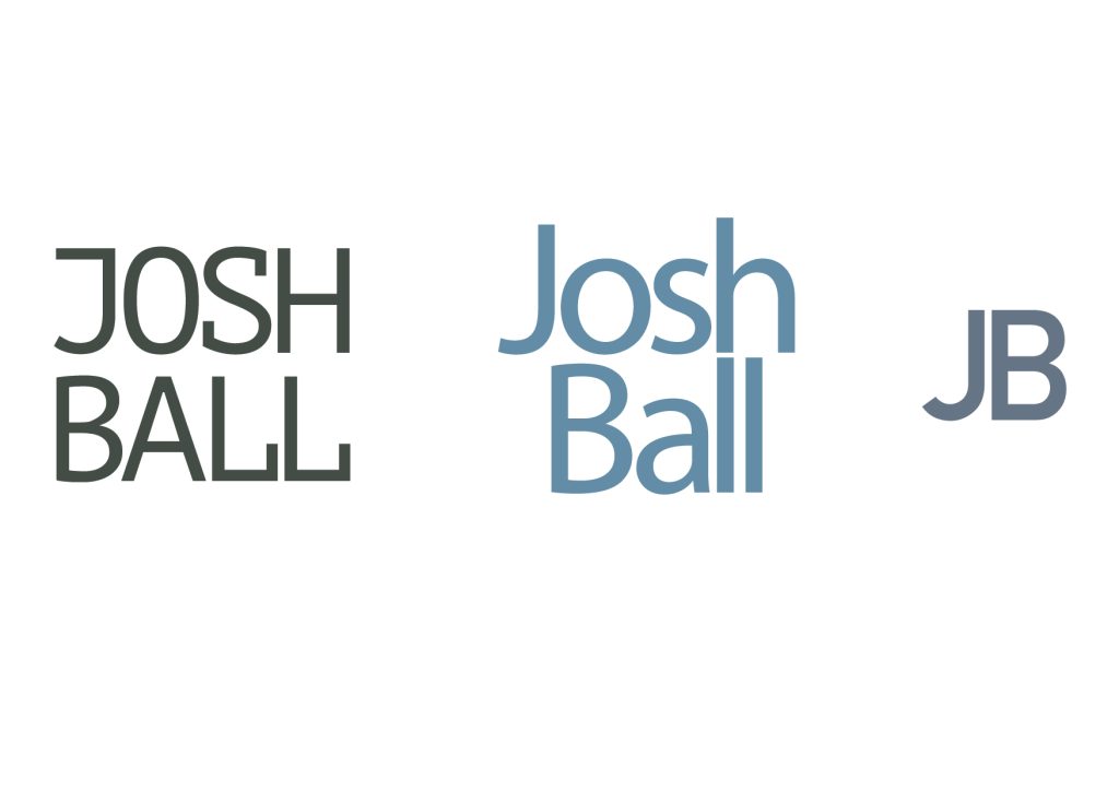
Other Designs
References
Color Psychology (2023) Navy Blue: Color Code, Meaning, Symbolism and Psychology. Available Online: https://www.colorpsychology.org/navy-blue/ [Accessed 07/12/23]
Kimp (2023) Serif Vs Sans Serif – The Dispute Of Fonts. Available Online: https://www.kimp.io/serif-vs-sans-serif/#gc5ec12ff7e48 [Accessed 02/11/23]