Design 1

For this version, I’ve reused the same base image from the Illustrator version but experimented more with the colours to make up the subject along with the background. For the subject, the colours used are custom made using the colour picker to try and better represent the main colours. I find that using the eye dropper often doesn’t pick up the right colours if the image is a lower quality, which this one is.
For the background, my original idea was to try and create a sunset using the gradient tool. However, after selecting the colours desired, out of curiosity I changed the type from “Solid” to “Noise” which completely changed the colours. Although it wasn’t at all what I was looking for, I was able to get an eye-catching effect after changing the roughness of the noise gradient, showing a blend of pastel colours which looked quite cool.
Design 2
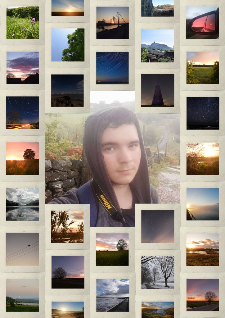
This portrait is made up using some of my favourite photos I’ve taken over the past few years. As seen, a lot of them are sky focused with only a few focusing on smaller details as skies have always been a big interest of mine. To make each image clearly seen, I’ve added a boarder around each which makes a grid in the background. The earth tone of the boarder helps the viewer to focus on the images and be able to decipher each individual image. The original image that I have recreated in other portraits has been used as a centre image with the other images flowing diagonally aligned with each other to add a variation instead of horizontal lines. These images represent my interest in the beauty of the world around us, mainly focusing on the bigger picture, in this case, large skies.