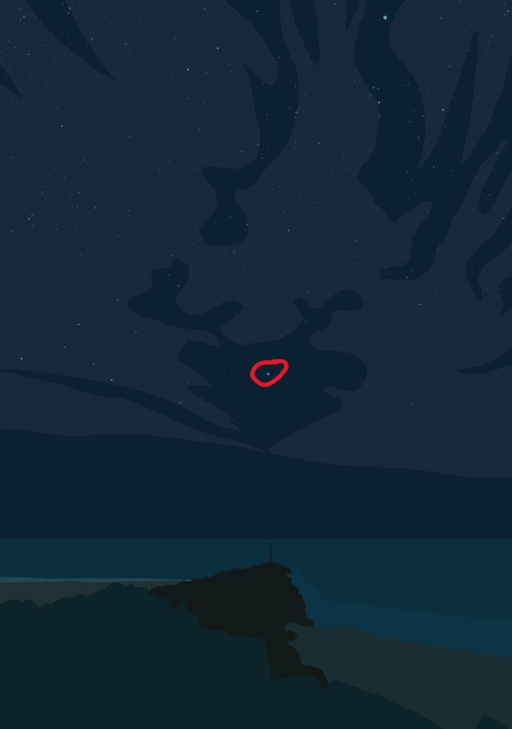
Design 1
Showing that people need to appreciate the things around them is my main goal. To show it, I’ve recreated a photograph that I’ve taken of a night sky landscape. The land is used as a leading line to point towards the sky to help the viewer navigate the poster. Rocks leading upwards are only outlined with 2 basic colours to show the difference in lighting and allowing the viewer not to lose focus on the main subject which is the sky. This is enforcing the need to appreciate the view. Another way this is enforced is the lack of detail in the foreground. The beach, rocks, and water all lack detail compared to the sky that is full of flowing clouds and stars.
Design 2
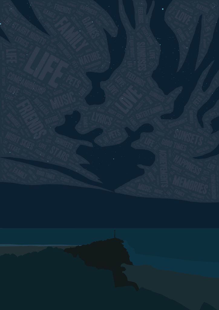
I asked a few close friends about things they appreciate in life and used those words along with some of my own to make the clouds into wordclouds. My original idea was to use these words and wrap them around the stars to give them a pointy texture. However, after exporting the image to see how it looked, the words were completely unreadable because of how small they were. The idea is that the things that people appreciated make up a larger image, putting across the fact that these small things can make up something big in your life such as who you are. Words like “Life, Family, Friends” are larger as they were the most common answers from different people. This shows that they play the biggest part in what people appreciate the most.
Failed Design