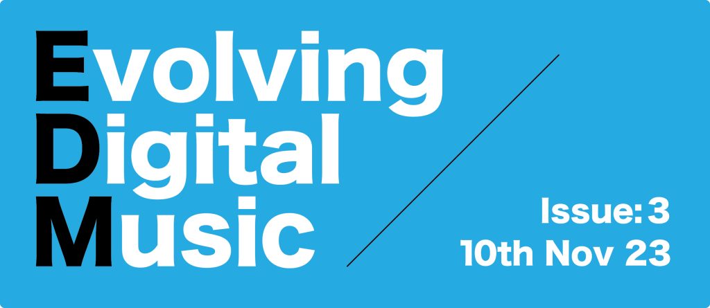
For the brand name I have chosen “Evolving Digital Music”. The first letters of each word spell “EDM” which is a genre of music also known as “Electronic Dance Music”. To highlight this relation, these letters are black, whereas the rest are white. This meant that for the background I would need another strong contrasting colour so red was used. Red allows both the black and white text to be easily read.
Because each word gets shorter after each other, it creates an ascending line after them. I have added this line visually as it connotes the evolving side where digital music is moving upwards in progression and at a constant pace. I tried to add an arrowhead onto the top of the line, however I did not feel like it worked as it looked top-heavy. The black line also acts as a divider, this allows space on the right for extra detail such as the Issue and Date. This stops it being empty space while also keeping the main information condensed and well kept.
Different Ideas
Typography
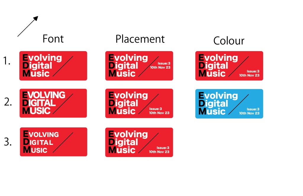
The main part of the design I have been trying different ideas with is the typography. I was unsure which case and size worked best, but eventually decided design 1 with a capital at the start then lowercase looked best. It was much easier to work with the kerning, allowing me to get consistent spacing, whereas in design 2 (all capitals) it was too little, or some words would stretch too far. Design 3 used all capitals but with all but the first letter being the hight of a lowercase letter. This ended up looking having an uneven kerning too and some capitals like the L feeling too small. These reasons made me decide that design 1 looked the most professional in terms of typography.
Issue and Date
An idea is to put the issue and date in part of the blank space on the right. This gives the viewer a consistent and easy to find position so that they know what issue number it is. Storing this information within the masthead gives the viewer the ability to instantly understand both what the magazine’s overall theme is and if it’s the most up to date issue. When experimenting with how to position the issue and date, design 3 seemed to work best visually. Having the text aligned towards the right side allows each line of text to flow better with the divider, making it more visually appealing. Also positioning it towards the bottom gives space for any other potentially needed information, such as a special issue name.
Colour
After further developing other features such as the Typographical standards, I realised that the red background did not conform to the colour scheme. Because of this I ended up changing the background to blue to stick within the brand identity.
Final