Typography has two main purposes in graphic design. The first is to promote legibility, and the second is to help communicate the messaging, tone, and sentiment of a design piece.” (S. Corrigan, 2023)
S. Corrigan (2023) Why Is Typography Important in Graphic Design?. Available Online: https://www.flux-academy.com/blog/why-is-typography-important-in-graphic-design[Accessed 31/10/2023]
Good Typography
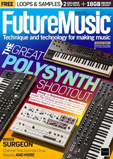
The typography used in this design by “FutureMusic” uses colours along with the composition to create a visually appealing cover for the viewer. The typography ends up using 3 different colours along with one section being the colour of the background, highlighted in white boxes. Each colour contrasts the background but with a complementary colour. The light blue shades in “Polysynth” seem to be opposite colours from the background which gives a clear contrast to the background while still fitting well into the overall theme. ”Polysynth” also has a much bolder font to catch the reader’s attention, meaning they instantly know what the issue is about. This is also supported by the surrounding images of synths.
The composition also follows the Z rule, as the type goes across the top then diagonally down to the bottom right, forming a partial Z shape. The type down the middle has created an angled perspective which guides the viewer through the composition, making the surround synths almost act as scenery for the journey through the text. Having this text angled within the shown synths also uses up the space around efficiently with them helping to guide you through the cover.
The rainbow style colours in the background also connote a similar theme to old synth wave genres which used similar colours in music videos and album covers. These colours along with the sans-serif font give the older style a modern twist linking in with the “Future” theme of the cover.
Bad Typography
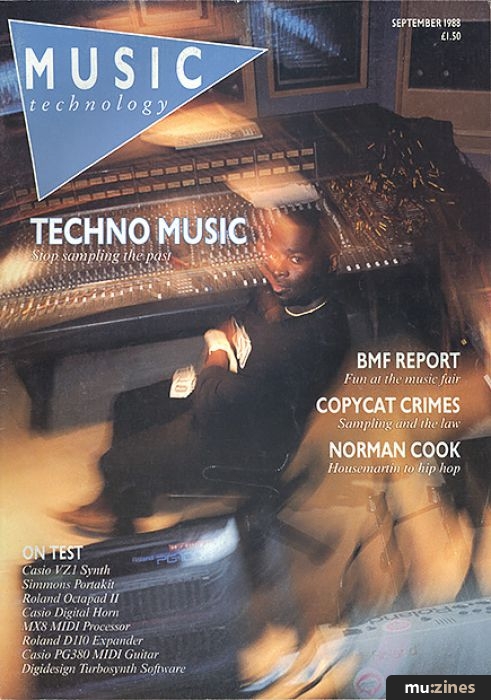
The typography in this cover from “Music Technology” doesn’t work well because the white text doesn’t have much contrast with the background colours. This makes it hard to read along with the fact that the typography in some places is too small and too thin. Especially in the bottom left, there is so much more space that could have been used around that area, but it has instead been wasted and made the text much harder to read than necessary. Some parts of the background have a blurred, spiralling effect to draw the viewer in the towards the middle. It could also be connoting the speed that technology is advancing in music production world. However, especially towards the right, these blurs make the text on top hard to read because of the slightly changing shades of the light colour underneath.
For the logo, the typography’s kerning is too large. It feels like it has been made as large as possible just to take up as much space as it can, making it seem unprofessional as if it hadn’t been planned properly.
Redesign
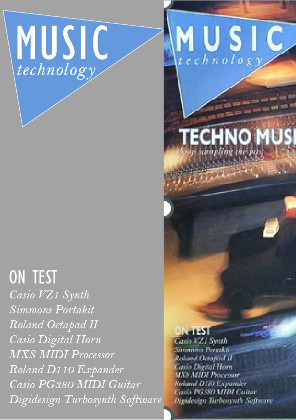
To fix this design, I have kept using a white colour for the text along with increasing the font’s size. This gives a larger contrast to the background and increases the readability of the type whilst also remaining in the brand’s identity colours.
I have also slightly changed the shape of the triangular logo; I have brought in the right side to make the length shorter. This has allowed for the kerning to decrease in size, making the logo look cleaner and more confined.
References
Future Music (2023) Issue: May 2023. Available Online: https://www.discountmags.com/magazine/future-music-april-4-2023-digital [Accessed 02/11/23]
Music Technology (1988) Issue: September 1988. Available Online: https://www.muzines.co.uk/mags/mt/88/09/81 [Accessed 02/11/23]