Type and Colour
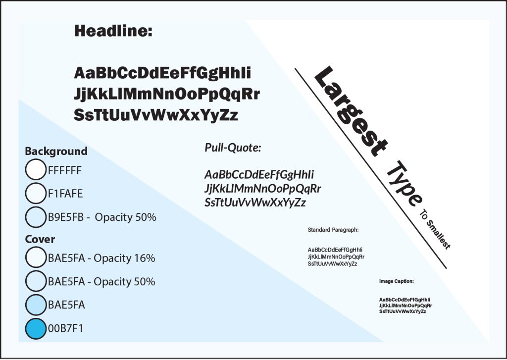
To show the variation in the size of different fonts, I’ve laid them out going from largest to smallest. Each section shows what the font is used for along with each variation of each letter. Towards the right, it also shows the direct comparison of each font and how their size varies so that the viewer can have a better understanding of the impact of each font used.
Another feature on this page is that the colours that are used across different pages are show with what colour code and opacity they use. Within the cover, most colours used are the exact same colour but then use a varied opacity to achieve different shades of the same blue. This allows the colour scheme across the pages to be consistent and compatible with one another.
Cover
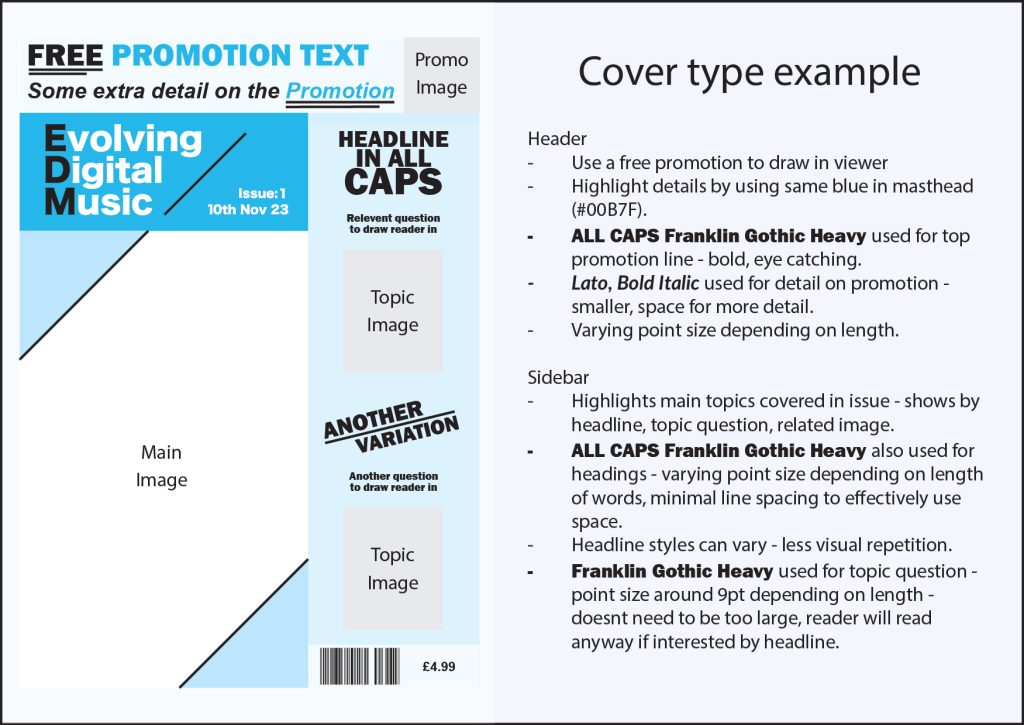
A breakdown of the cover is used to show the usage of different fonts throughout it. Only 2 different fonts are used which are Lato, Bold Italic and Franklin Gothic Heavy. However, Franklin Gothic Heavy is used in 2 different ways; all capitals for the promotional text and headlines then for the related topic questions it uses capitals in a standard form of only at the beginning. This is done so that the main subjects are more eye-catching, and the related questions don’t take away the viewer’s attention. If the reader is interested in the subject, they will continue reading anyway so there is no need to distract from the main subjects.
Because this is the master grid for this magazine cover, any information has been replaced with what sort of information would be used in its place. This makes it an easy-to-follow template as it is also stated how the fonts should be used. An example of this is that depending on the headline length, the point size of the text may vary to suit the space better.
Single Spread
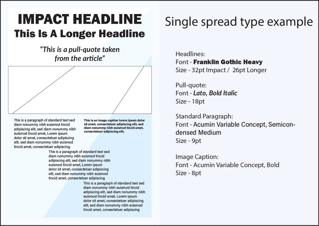
A much simpler approach has been taken for the last page, only showing the specifics of each font. Every font that has been used is sans-serif. This has been done as serif gives a more “classical” feel, but the focus of this magazine is the future. I’ve included a rough design template so that how the different typefaces should be used can be easily seen. On the right side, it is stated which font is used, the point size, and what they are used for. This allows the typographical standards to be easily replicated by anyone that needs to use them. In the magazine spreads, none of the point sizes would change, meaning the specific point sizes are stated unlike for the cover.