Layout
With this magazine designed to be a mainstream product aimed towards 18–40-year-olds, I’ve tried to go with a similar to conventional master grid for the layout of the cover. There are 4 main features included; a promotional offer, the masthead, a sidebar including featured articles, and a main image.
Free or Exclusive Offer

The header of each issue offers a free or exclusive feature included within the issue. Using this as a selling point of the magazine draws the viewer in, making this magazine feel better value than others as they are getting something else that goes along with it. Often in shops, magazine covers overlap each other, meaning that only the top third or so of many pages are visible. That makes the top section necessary to make an impact instantly, which is why the text is bold and almost the largest on the page.
Masthead
The masthead has been placed in a way that allows it to be enlarged to a reasonable size to help create the surrounding features. With the size controlling the width of the sidebar and main image, I was able to find a suitable size that allowed the masthead to be large enough to have a visual impact on the viewer while also giving the sidebar and main image plenty of room for getting across relevant information to piece together the complete cover.
Sidebar
Details such as subject topics and the relevant topic question are fitted into the sidebar. These allow the viewer to gain an insight into what the issue is focusing on. Both the bold, varying titles and the relating images help to grab the viewer’s attention. This is done so that it can be easily understood what content will be covered and if it is something the viewer would be interested in reading.
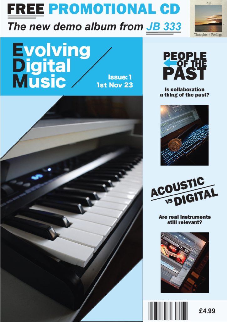
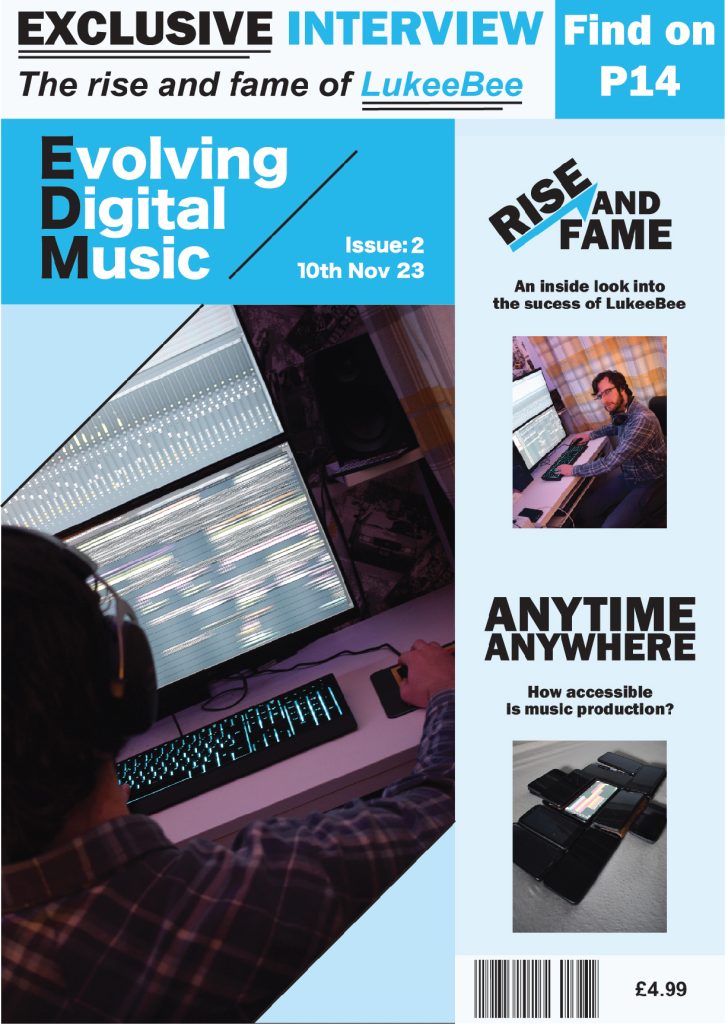
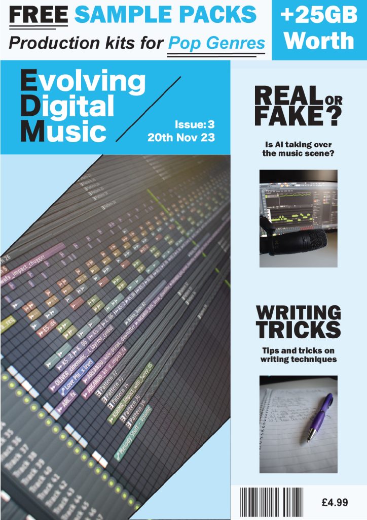
Main Image
A diagonally placed crop has been placed on the top left and bottom right corner of the main image. The angle was determined by the line used in the masthead to create continuity throughout the composition. Once again, the upwards angle has been used to connote the evolving side of the digital music production.
Colour
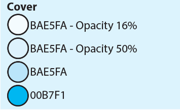
Each section of the cover uses a different shade of blue. To make sure every shade is compatible with each other, I used the opacity of one shade to create lighter variations. This technique was used on all blues but the masthead which uses a more dominant blue to highlight that that is the masthead, so the viewer knows what the magazine is along with the details such as the date and issue. The 2 base colours that are used are 00B7F1 for the masthead, then BAE5FA with 100%, 50%, and 16% opacity for the image crop, sidebar, and promotional background respectively to create a unique blend of complementary shades.